Most new crypto traders lose money not because they picked the wrong coin, but because they don’t know how to read a chart. You see a green candle, think the price is going up, and buy-only to watch it drop 20% in an hour. That’s not bad luck. That’s not being unlucky with Bitcoin. That’s not knowing what the chart is actually showing you.
Crypto charts aren’t magic. They’re data turned into pictures. And like any language, you need to learn the alphabet before you can read a sentence. The good news? You don’t need to be a mathematician or a Wall Street analyst. You just need to understand what each piece means-and what to ignore.
What You’re Actually Looking At
A crypto trading chart shows price movement over time. That’s it. But that simple idea hides layers of information. Every dot, line, or candle tells a story about buyers and sellers fighting for control.
There are three main types of charts: line, bar, and candlestick. Line charts are the simplest-they just connect closing prices. They’re fine if you’re tracking a long-term trend, but they hide everything that happened in between. Bar charts show open, high, low, and close as vertical lines with tiny horizontal ticks. They’re accurate but messy. Candlestick charts? That’s what almost every serious trader uses.
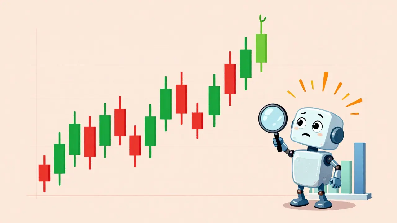
Why? Because candlesticks tell you the emotion behind the price. A green candle means the closing price was higher than the opening price. Red means it closed lower. The body of the candle is the range between open and close. The thin lines above and below? Those are wicks-showing the highest and lowest prices during that time period.
Here’s what that looks like in real life: If a candle has a long upper wick and a small green body, it means buyers pushed price up hard-but sellers fought back and drove it down near the open. That’s a warning sign. If you see that after a big rally, it’s not a green light to buy. It’s a red flag.
Timeframes: The Most Important Choice You’ll Make
One of the biggest mistakes beginners make? Trading on the wrong timeframe. You see a 5-minute chart with a perfect bullish pattern and jump in. Ten minutes later, the whole thing reverses. Why? Because the 5-minute chart is noise. The real story is on the daily chart.
Think of timeframes like zoom levels on a map. A 1-minute chart is like looking at a single street. A daily chart is like looking at the whole city. If you’re trying to find your way, you start with the big picture. Then you zoom in.
Most successful traders use a three-tier system:
- Daily chart: Your main direction. Is the trend up, down, or sideways? This tells you whether to be buying or avoiding.
- 4-hour chart: Your entry signal. Look for candlestick patterns or breakouts here.
- 15-minute chart: Your precise entry point. Wait for a clean setup before pulling the trigger.
According to Kraken’s 2025 user data, 68.7% of active traders use daily charts as their primary tool. That’s not a coincidence. It’s because daily charts filter out the noise. A 5-minute spike could be a bot trade or a whale dumping. A daily close above a key level? That’s real.
Candlestick Patterns That Actually Work
Not every candlestick pattern is useful. Some are just folklore. But a few have proven themselves across years and market cycles.
Bullish Engulfing: This happens when a red candle is followed by a green candle that completely covers the body of the red one. It means sellers were in control, but buyers came in strong and took over. In 2024, this pattern had a 73.6% success rate in predicting reversals across Bitcoin, Ethereum, and other top coins, according to TradingView’s backtested data.
Cup and Handle: Looks like a teacup with a handle. The cup is a U-shaped dip, and the handle is a small pullback after the bounce. When price breaks above the handle’s high, it often kicks off a big rally. Trader u/HalvingHunter used this pattern to catch Bitcoin’s 2024 halving pump and made 387% returns. It’s not magic-it’s structure.
Head and Shoulders: The opposite of the cup. A big peak (head), then two smaller peaks on either side (shoulders). When price breaks below the neckline (the line connecting the lows between shoulders), it usually means a big drop is coming. But here’s the catch: in crypto, this pattern needs a longer confirmation than in stocks. The Chartered Market Technician Association found crypto head and shoulders patterns need 23.7% more time to validate than traditional markets.
Don’t chase every pattern. Wait for high-probability setups. And always check the volume.

Volume: The Secret Weapon Most Beginners Ignore
Price can lie. Volume doesn’t.
Volume is the number of coins traded during a time period. It shows real interest. A price rise with low volume? That’s weak. It could be a pump-and-dump. A price rise with volume 35% above the 20-day average? That’s real buying pressure.
Crypto.com’s 2024 analysis found that 76.8% of sustained upward moves happened when volume spiked above that threshold. On the flip side, 71.2% of losing trades in Kraken’s 2024 report happened during low-volume periods-even when the chart looked bullish.
Here’s how to use it: When you see a breakout or a reversal pattern, look at the volume bar beneath the chart. Is it green and taller than the bars before it? Good. Is it red and shrinking? Walk away. No matter how pretty the candle looks.
Support and Resistance: The Invisible Walls
Price doesn’t move randomly. It bounces off levels where people have traded before. These are called support and resistance.
Support is a price level where buyers step in and stop the fall. Think of it like a floor. Resistance is where sellers step in and stop the rise. Think of it like a ceiling.
Look at Bitcoin’s price history. There are clear levels where it bounced off again and again-like $30,000 in 2023, or $68,000 in early 2024. These aren’t guesses. They’re real price zones where thousands of orders clustered.
Draw horizontal lines on your chart at those levels. When price approaches them, watch what happens. Does it bounce? Break through? That tells you who’s in control.
Don’t overdo it. Three or four key levels are enough. Too many lines make the chart messy and distract you from the real signals.
What Not to Do
Here’s what kills most beginners:
- Using too many indicators: RSI, MACD, Stochastic, Bollinger Bands, Fibonacci-throwing them all on one chart is like listening to ten people talk at once. You’ll hear nothing. Binance’s risk team found 79.2% of losing accounts used five or more indicators.
- Trading on low-volume coins: Coins under $100 million market cap have 31.2% higher pattern failure rates, according to Binance’s transparency report. Avoid them until you’ve mastered Bitcoin and Ethereum.
- Ignoring the daily chart: If your daily trend is down, don’t buy just because the 1-hour chart looks green. You’re fighting the tide.
- Thinking one pattern guarantees profit: No pattern works 100% of the time. Even the best ones succeed 65-75% of the time. That’s enough to make money-if you manage risk.
How to Start Learning (Step by Step)
You don’t need a course. You don’t need a mentor. You need a plan.
Follow this 4-phase system, recommended by Breet.io’s 2025 guide:
- Phase 1 (2-3 weeks): Only look at daily candlestick charts. No indicators. Just ask: Is the trend up, down, or flat? Learn to spot higher highs and higher lows (bullish) vs. lower highs and lower lows (bearish).
- Phase 2 (3-4 weeks): Add candlestick patterns. Learn to recognize Bullish Engulfing, Hammer, Shooting Star, and Doji. Practice spotting them on past charts. Aim for 80% accuracy.
- Phase 3 (4-6 weeks): Add volume. Check every pattern you see. Is volume confirming the move? If not, ignore it.
- Phase 4 (6-8 weeks): Combine timeframes. Use daily for direction, 4-hour for entry, 15-minute for timing. This is the professional standard.
Use TradingView’s free plan. It’s enough. Don’t upgrade until you’ve mastered the basics. Most beginners waste money on premium features they don’t understand.
Real Talk: Why Most People Fail
The SEC says 68.3% of retail crypto losses come from overreliance on charts without understanding market context. That’s not just about patterns. It’s about psychology.
People see a green candle and think, “This is my chance.” They ignore volume. They ignore the daily trend. They ignore risk. They chase.
The best traders? They wait. They watch. They confirm. They enter only when the odds are stacked in their favor. Then they manage their position. They don’t try to catch every move. They catch the big ones.
Remember: Crypto markets run 24/7. There’s always another chart. Another opportunity. You don’t have to trade every day. You don’t have to trade every setup. You just have to trade the right ones.
Start simple. Master the basics. Let the charts speak. And never forget: volume is truth. Price is a story. And the trend is your friend.
What is the best chart type for crypto trading?
Candlestick charts are the best for crypto trading. They show open, high, low, and close prices in one visual, making it easy to spot trends, reversals, and trader sentiment. Over 89% of intermediate and advanced traders use them, according to Coinbase’s 2025 survey. Line and bar charts are less effective because they don’t clearly show price action between open and close.
How do I know if a breakout is real or fake?
A real breakout has three things: price closes beyond a key resistance or support level, volume spikes above the 20-period average by at least 35%, and the move holds for at least 2-3 candles. Fake breakouts happen on low volume and quickly reverse. Always wait for confirmation-don’t jump in on the first touch.
Should I use indicators like RSI or MACD?
Only after you’ve mastered price action and volume. Indicators are lagging-they react to price, not predict it. Many beginners overload their charts with 5+ indicators and get confused. Start with just candlesticks and volume. Add one indicator later if it helps you confirm what you’re already seeing.
What timeframe should I use as a beginner?
Start with the daily chart. It filters out the noise of 5-minute or 15-minute swings. Once you understand the daily trend, use the 4-hour chart to find entry points. Avoid trading on anything below 1-hour until you’ve practiced for at least 3 months. Most beginners lose money by trading too fast.
Can I trust pattern recognition tools on TradingView?
Use them as a helper, not a guru. TradingView’s Pattern Score tool shows historical success rates, but past performance doesn’t guarantee future results. Always verify the pattern yourself. Look at volume, context, and the bigger timeframe. Automated tools can’t read market sentiment or news events.
Is technical analysis enough for crypto trading?
No. Technical analysis tells you when to trade, but not why. You should also understand basic fundamentals: What’s the coin for? Is it being adopted? Are there upcoming upgrades? Or major regulatory news? The most successful traders combine technicals with a basic grasp of fundamentals. Don’t ignore the news.
10 Comments
Oh wow, another ‘candlesticks are magic’ guide. Let me guess-next you’ll tell me the moon phase affects Bitcoin? 🤡 I’ve seen 100 of these. The real secret? Algorithms pump coins at 3 a.m. while you’re dreaming of green candles. Your ‘73.6% success rate’? That’s backtested on data from when whales were still sleeping. Wake up.
USA and Canada are getting owned by these ‘crypto gurus’ pushing TradingView like it’s the holy grail. Meanwhile, the Fed’s printing money like it’s Monopoly. Charts don’t care about central bank manipulation. You think a ‘cup and handle’ matters when the FED’s about to drop a rate cut? Nah. This is all distraction. Real wealth is in gold, cash, and staying off the grid. Trust me-I’ve seen the leaks.
Hey everyone-I really appreciate how this post breaks things down without the usual hype. I’m a total newbie, and I was drowning in indicators until I started just watching daily candles and volume. It’s like learning to read again. No rush. No FOMO. Just noticing what’s actually happening. If you’re feeling overwhelmed, start with one chart. One day. One pattern. You don’t need to know everything right away. You just need to start. 💛
Valid point on the three-tier timeframe system-this is standard institutional practice. But let’s not romanticize candlesticks. They’re descriptive, not predictive. The real edge is in order flow analysis and liquidity pools, which most retail traders ignore because they’re not visualized in TradingView’s free tier. Volume spikes? Great. But what’s the depth of the order book? That’s where the real story lives. Most of these ‘patterns’ are just noise clusters.
THIS. This is the best beginner guide I’ve seen in months. 🙌 I used to trade 1m charts like a maniac-lost 80% of my first $5k. Then I switched to daily + volume + one 4h entry. Made my first 3x in 3 weeks. Don’t overcomplicate it. Volume is truth. Price is drama. And if you’re not checking the 20-day avg, you’re gambling. Also, use TradingView’s ‘volume profile’ tool-it’s free and game-changing. You got this!
I started with this exact method last year and it changed everything. No indicators. Just daily candles. I kept a journal. Wrote down why I thought a pattern mattered. Sometimes I was wrong. Often I was right. The biggest shift? I stopped trading when I was bored. That’s when I lost. Now I wait. And wait. And wait. And then-boom-I get one clean setup and I’m out. Simple. Quiet. Powerful.
YOU ALL ARE MISSING THE POINT. This isn’t about candlesticks or volume-it’s about CONTROL. The entire crypto market is a rigged casino. The same 12 hedge funds manipulate every ‘support level’ you see. They create fake breakouts. They pump coins with bots. They flush retail traders into losing positions so they can short the next day. You think your ‘73.6% success rate’ means anything when the entire system is designed to extract your money? I’ve worked in algo trading. I’ve seen the code. This is a slaughterhouse dressed as a seminar.
lol so you’re telling me I shouldnt use RSI? bro I’ve been using RSI since 2017 and I’m rich. you’re just mad cause you lost your dogecoin savings. candlesticks are for kids. real traders use fibs + macd + bollinger + volume + 3 timeframes + sentiment analysis. if you dont have 7 indicators on your chart you’re not serious. also btc is going to 200k by 2025. trust me i read it on twitter.
Volume confirms. Everything else is noise. If the candle looks pretty but volume is flat? Walk away. That’s it.
There’s a quiet poetry in watching price move like tides-responding not to charts, but to human fear and hope. We build these symbols-candles, lines, volumes-as if they’re laws of nature. But they’re just mirrors. They show us what we believe, not what’s true. The real skill isn’t reading the chart-it’s reading yourself. When you stop chasing the green, and start listening to the silence between the candles… that’s when the market begins to speak. Not in patterns. In pauses.